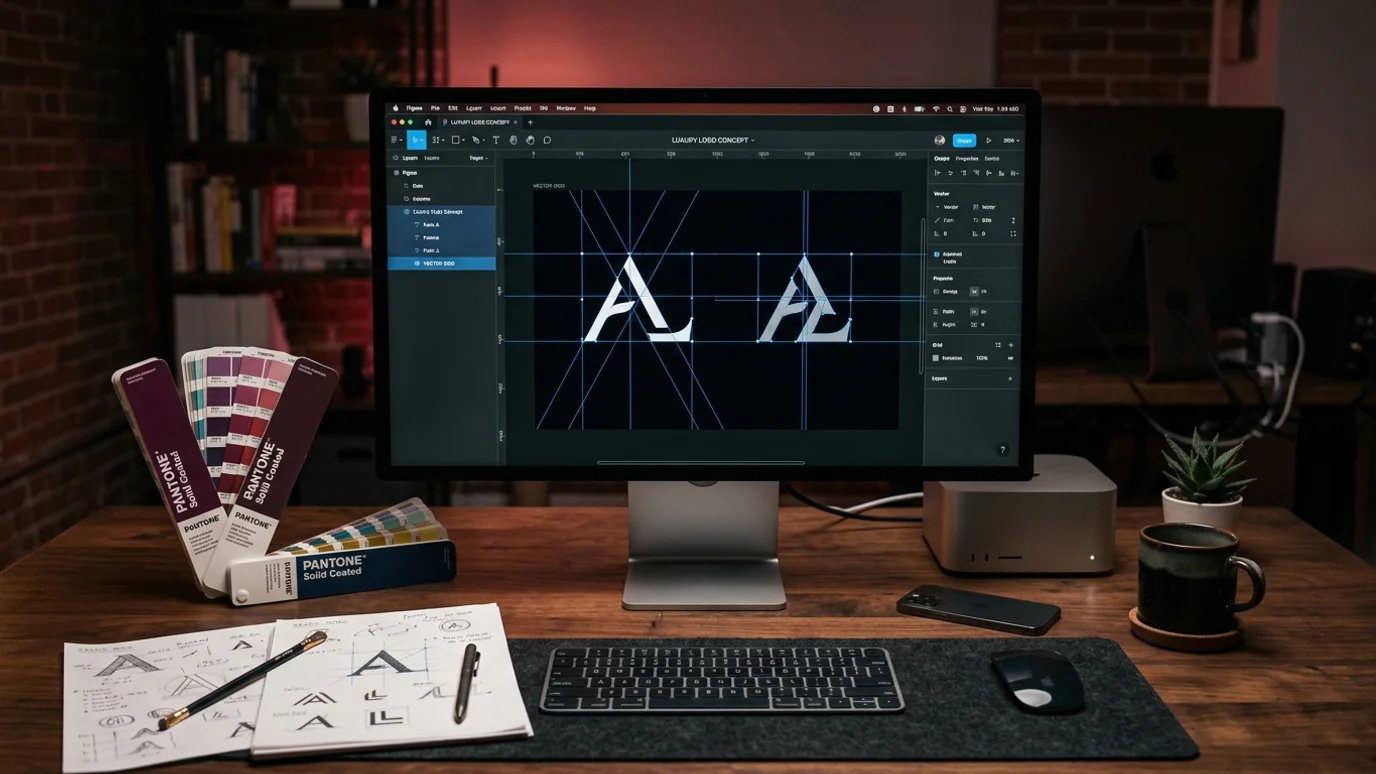
A logo on its own is not an identity
The situation we meet most often looks like this. The company has a logo, but two employees are using two different files. One colour on the quotation, another on the signage, a third version entirely on social media. To an outsider that inconsistency reads as a company that has not got its own house in order, which is an unfortunate signal to send to a first-time buyer.
A corporate identity is the rule set that ends the drift: which colour values, which typeface, how much clear space around the mark, which version goes on which background. Once it exists, an employee who joins next year can still put the right file in the right place without asking anyone.
In an industrial setting there is a physical dimension to this that screen-first designers routinely miss. The mark does not only live on a monitor. It goes onto signage, helmets, vehicle panels, product labels, shipping cartons and exhibition walls. A logo that disappears when reduced to a single colour, breaks up at small sizes, or carries detail too fine to cut or weld is useless on the floor however good it looks in a presentation.